Laif 900 Balance
Designrelaunch / Logo & Packaging Design
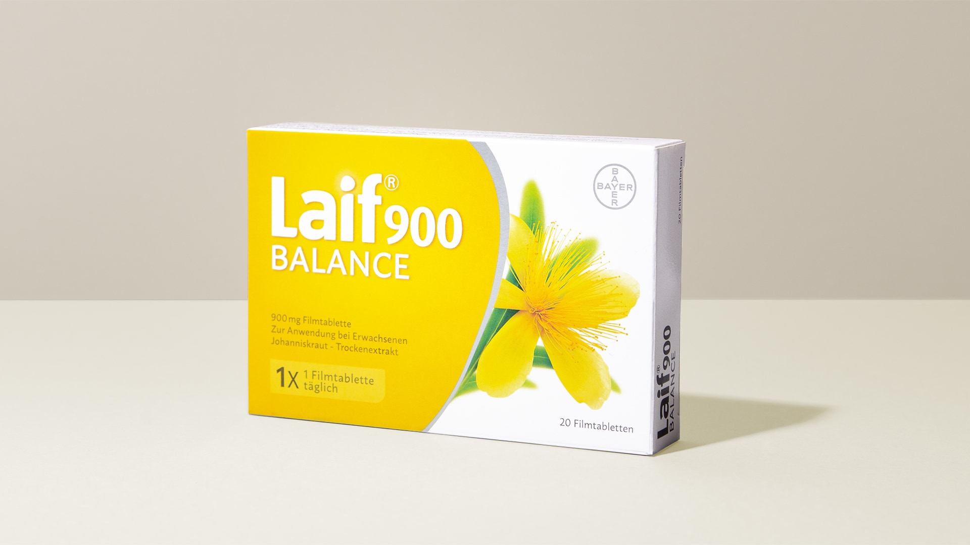
The relaunch of Laif 900 Balance continues to carry forward central elements and features from the relaunch of Laif.
The arched element with the warm yellow gradient conveys a positive mood. Simultaneously, it represents the color of the St. John's Wort product component and provides orientation on the shelf.
The light-infused, contemporary depiction of the St. John's Wort blossom is also displayed in this packaging.

The arched element, newly devised with the launch of Calmalaif, serves as both a design and communication element, bolstering the visual differentiation of Laif products. Itlays the foundation for an expandable product range in which the element is utilizedand uniquely interpreted for each application.
The packaging's arched element is also integrated into the communication strategy and utilized as an extended key visual in conjunction with the logo or as a highlightedarea.
Through all interactions with the brand, this enhances the recognizability and cohesiveness of the Laif product family.
Der erste Baustein der Modernisierung ist die fotorealistische, lichtdurchflutete Abbildung der Blüte. Die graphischen und textlichen Elemente wurden ebenfalls neu arrangiert und geben so dem Produktnamen und Keyvisual mehr Raum und der Verpackung eine ruhige und sachliche Struktur.


brand.pack
brandpack gmbh
Leverkusenstr. 54
D-22761 Hamburg
© Copyright 2026
Cookies
Get in touch

