Salthouse Med
Designrelaunch / Logo & Packaging Design
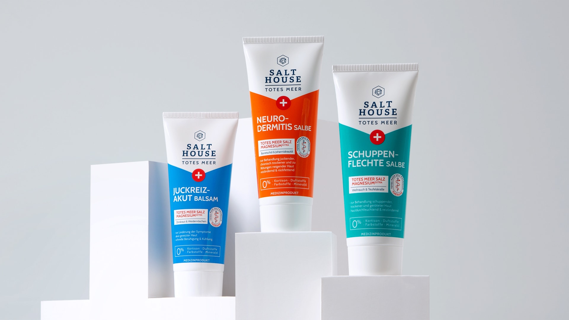
In addition to the cosmetic ‚Therapie‘ range Salthouse® also has a medical line focussing on skin issues.
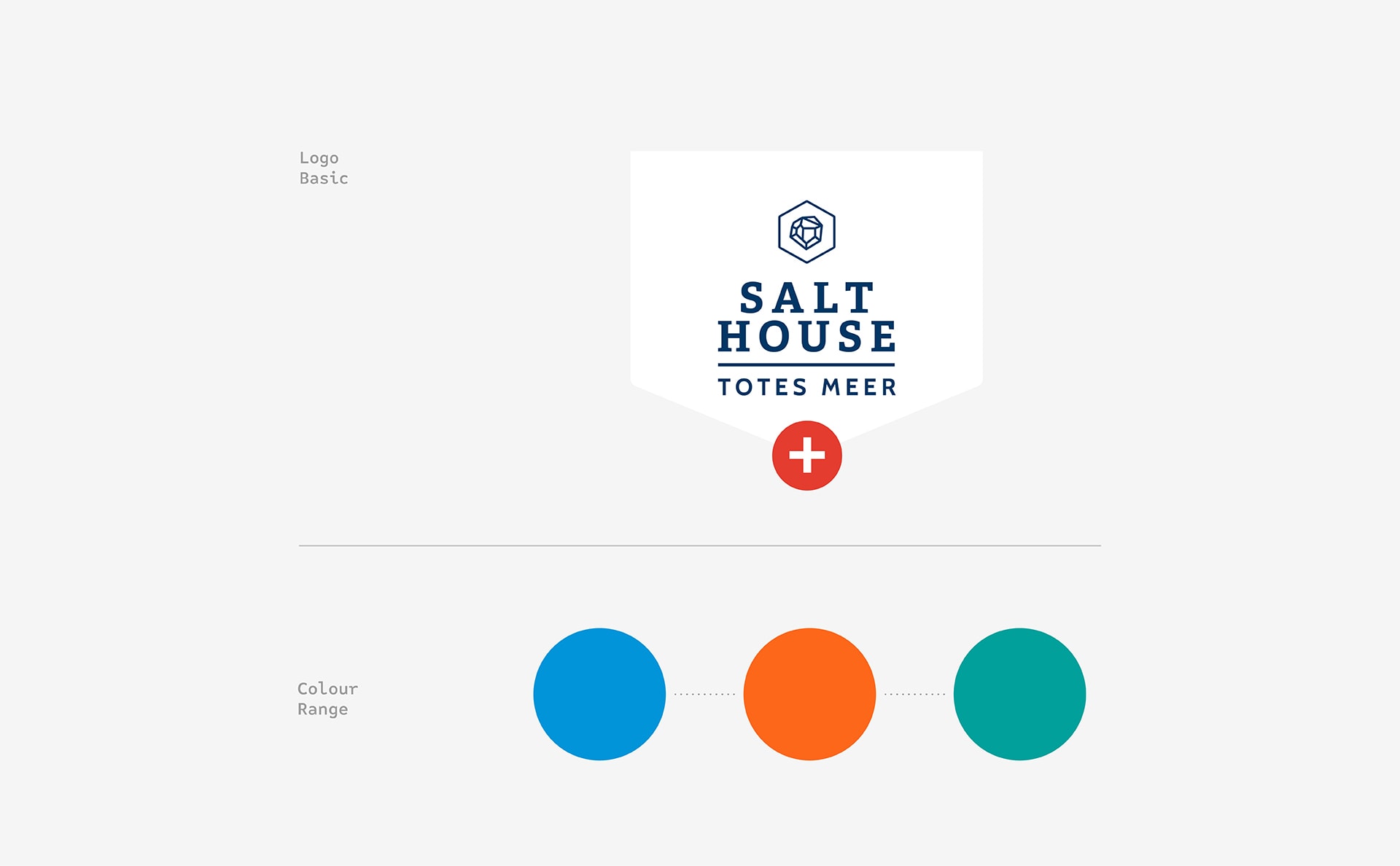
We highlighted the medical aspect by switching the brand space into white and taking over there cross as a wellknown graphic symbol.
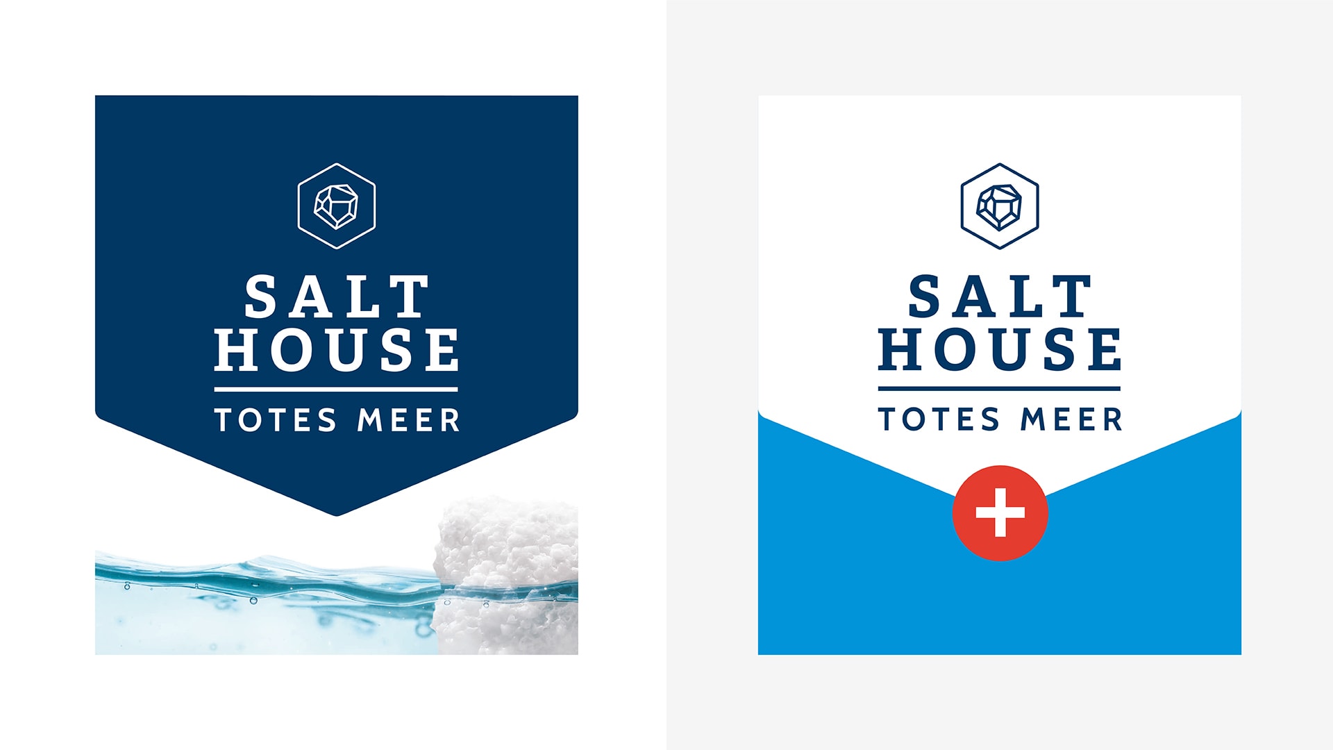
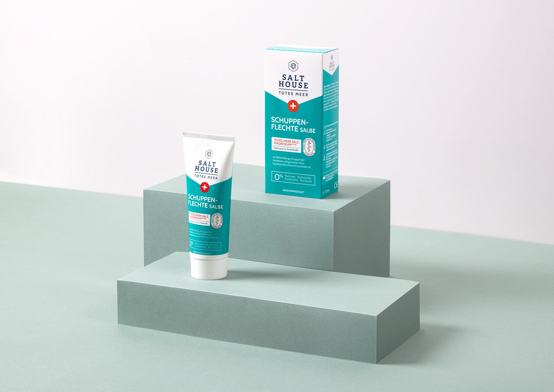
A strong colour blocking code ensures easy product orientation while the information hierarchy remains untouched. This approach provides just the right level of differentiation to the cosmetic products and still stays consistent throughout the brand.?
Die medizinisch natürliche Wirkkompetenz wird durch das austarierte Verhältnis von Farbe, Weißanteil und Keyvisual erreicht. Das Bogenelement mit dem farbigen Bereich strukturiert die Verpackung und bietet Möglichkeiten von Sortimentserweiterungen.
Die medizinisch natürliche Wirkkompetenz wird durch das austarierte Verhältnis von Farbe, Weißanteil und Keyvisual erreicht. Das Bogenelement mit dem farbigen Bereich strukturiert die Verpackung und bietet Möglichkeiten von Sortimentserweiterungen.


brand.pack
brandpack gmbh
Leverkusenstr. 54
D-22761 Hamburg
© Copyright 2026
Cookies
Language


Get in touch
Social Media
Social Media